In order for our group to understand what fonts would be best for us to use on our album, I decided to research different type of fonts which are use on albums. Below are three of the fonts which stood out the most for me.
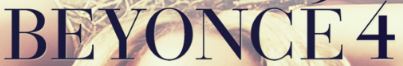
 As our the artist of our music video is female I decided to look at a variety of fonts which are used on female artist album covers. For example Beyonce, the font she used for her latest album Beyonce 4. From my research I found that the name of this font is Dream Orphan. What I like about this font is that it gives a sort of vintage, posh look to the album without taking away the fact it is an R'n'B album. Also the colour black (even though it is plain) gave some type of bold statement, which I believe represent the genre R'n'B. Additionally the contrast between the colour black and her complexion, gives the album a rich look

Unfortunately I were not able to find that exact font, however a font which I found similar to this font was Apple Garamond from dafont.com.
Using Adobe Photoshop I experimented with our artist name Melanie Fiona, both in lower case and capitals; to get an idea of what it may look like if placed on to the front of our album.
.jpg)
 Another female artist which I analysed the font on her album cover was Kelly Rowland. This album in particular is an R'n'B album which includes a lot of dance. Research showed this particular album was nominated for International Dance Award. Moreover as you can see the font in which she used is very thin with both inner and outer glower. This I believes represents the type of music included in her album - dance music; the type of music which you would hear in a club. Nonetheless the font illustrate or 'paints a atmosphere' of a club. As you can see below I attempted to find the closest font possible to the one featured on Kelly Rowland album:

This font is called Good Times also from the dafont.com. Unlike the font featured on the album this font is much thicker and bolder. This font in particular only has uppercase letter, therefore I was unable to see what it may look in lowercases. In order to achieve the similar font on Kelly Rowland's album I had to manipulate the font in Adobe Photoshop. Below is an image stating the quick steps I took to achieve this look.
Additionally another album font I looked at was Keyshia Cole - A Different Me, compared to the others I have reviewed, this font in particular was quite soft with a slight ombre effect. The swerves gives a gentle touch to the album. In someways the font gives the impression that the album will reveal a softer side to Keyshia Cole, therefore reflecting the name of the album 'A Different Me'.

 Using the font MTF Under Your Skin from
DaFont.com I tried to recreate the same font, to understand what the name Melanie Fiona may look like in a similar font; however I used the colour grey.
Using the font MTF Under Your Skin from
DaFont.com I tried to recreate the same font, to understand what the name Melanie Fiona may look like in a similar font; however I used the colour grey.
 After reviewing several different album cover fonts, we decided to take ideas from all Beyonce and Keyshia Cole albums which lead us to the font Apple Garamond. For example what we liked about Beyonce Album font is that the font looks bold and stands out, it also looks classy and vintage; additionally the font makes her name looks like a statement which is how we wanted our artist name to come across on her album. Furthermore what we liked from Keyshia Cole's Album font is the ombre effect, in which the colours used to create the ombre is based on the background. Nonetheless we have come up with a font which we believe represent our artist as bold and fearless.
CHANGES
We had made some minor changes to the font of our album cover. We found that using the gradient overlay with the colours black, white and pink contrasted greatly with the chosen image, therefore we changed the colours to pink and white. Below is our now chosen font:-